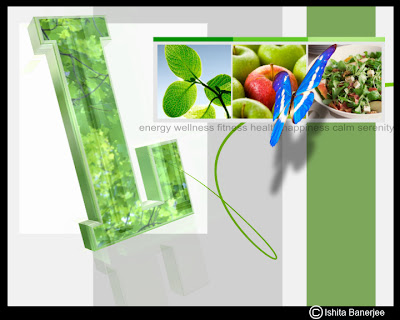
My love for white and clean layouts continued with the designs for the LIVING IT UP series. I used the letters LIVE in the title sequence to focus on health, well being and positive living. I used the butterfly to thread my sequences together and also bring an element of nature and life to my concept:
Here are the snaps
Here are the snaps


No comments:
Post a Comment