Showing posts with label design diaries principles of design. Show all posts

Tuesday, September 27, 2011

STATE OF THE NATION SERIES

State of the Nation is a series of shows on CNN IBN that investigates the State of urban India and the various issues faced by a rapidly growing economy and a vast and crowded population. These series of shows focus on opinion polls and the changing values and attitudes in the country.
When designing the show packaging, I focused on the Indian element, and used the tricolors of the Indian flag against a rising urban backdrop. I used roadsigns to talk about being at a crossroad of  change, confusion and the road that leads forward. My approach was simple and stark. I did not want to use too many elements or embellishments. I kept the text and font crisp and clean and the dark blue-black backdrop draws the eye to the pop of orange and the green of the tricolor streaks. Designs and the storyboard of the title sequence follow:

Monday, September 26, 2011

SECRET KITCHEN

Secret Kitchen show titles and packaging: CNN IBN's award winning show on food
Designed on Adobe Photoshop and Adobe After Effects

SPORTS TITLES: Golden Generation, a documentary of Indian cricketing greats


Golden Generation was a show on cricketing greats of India. Now, it is always tricky give sports a vitage grungy treatment, but here I chose to do something other than "sporty"
Cricket is a sport that superceeds all others in India and these cricketing legends featured on the show were role models and had immense mass followings. I gave the video and images a vintage wash and posterised the shots to further enhance their vintage appeal. I used a gold-burnt brown tone in the background and added grunge like elements as supporting motifs.
I liked how the design for the show turned out. It was simple, earthy, vintage and had soul of these cricketing greats speaking for themselves. Designed and composited on Adobe Photoshop and After Effects.


NOW SHOWING: title sequence

The glossy film show "NOW SHOWING" for CNN IBN was another unique challenge. It had to be glossy yet not overtly filmy. I used simple typography here to showcase the titles. I wanted the feel to be like the movie projection room where there was a beam of dusty light plaing the movie..so I used some flares, created some cool camera angles and viola..! the black background and the gold lettering with just a break of red gave me a plush palette to work with. Designs created on Viz Artist, composited on Adobe After Effects. 

Designs follow

Sunday, September 25, 2011

Backdrop for the Web 18 office

Backdrops for the Web 18 office. Designed to showcase the web functions, and highlight the work area with internet related imagery. The office backdrop would also be visible as the background of the news studio so I kept the colors really bright especially the blue which is a very camera friendly color. The sizes were huge, one of them was 42 feet in width so working with framing on such a large size was a challenge.


Thursday, September 22, 2011

FASHION: fashion week unzipped

The fashion weeks are celebrated with great style and oomph. This was the show titles that I did for the fashion week shows for CNN IBN. I played with color bars over stylized images of models on the ramp an amped up the volume with text and fun graphics. This was a composting project involving Viz artist, Adobe Photoshop and Adobe After Effects.

Wednesday, September 21, 2011

OLYMPICS

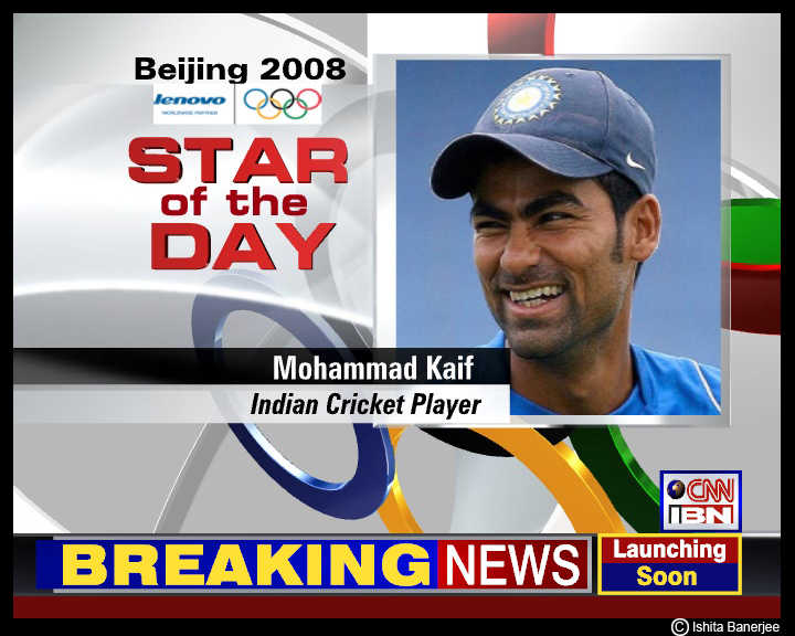
The Beijing Olympics in 2008 gave me a chance to work on some "sporty" design templates. I used a silvery-white background on viz artist and used the most obvious olympic symbol as my main element. By keeping the composition clean and limiting the use of exceptionally bright colors, I was able to maintain a clean and simple look for the templates. Designs follow:

MOVIE POSTER: PARADISE CALLING

Poster and wallpaper for the short film: Paradise calling

THE WEATHER

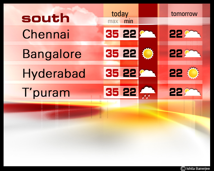
Ahh the weather...I love the weather. The drama, the serenity, the moodiness, the vibrancy, the anger, the melancholy and more. What can be more dynamic than the weather. Weather is the most fun to design. This was one of my very very first projects for CNN IBN. I wanted an all white design...i wanted the colors to glow and the concept was very simple. I divided India into the NORTH-SOUTH-EAST-WEST zones and gave each zone a color..RED BLUE YELLOW AND GREEN. It was a cakewalk from there...the designs kept building and i kept having fun!