Showing posts with label building a design. Show all posts

Tuesday, September 27, 2011

STATE OF THE NATION SERIES

State of the Nation is a series of shows on CNN IBN that investigates the State of urban India and the various issues faced by a rapidly growing economy and a vast and crowded population. These series of shows focus on opinion polls and the changing values and attitudes in the country.
When designing the show packaging, I focused on the Indian element, and used the tricolors of the Indian flag against a rising urban backdrop. I used roadsigns to talk about being at a crossroad of  change, confusion and the road that leads forward. My approach was simple and stark. I did not want to use too many elements or embellishments. I kept the text and font crisp and clean and the dark blue-black backdrop draws the eye to the pop of orange and the green of the tricolor streaks. Designs and the storyboard of the title sequence follow:

Monday, September 26, 2011

NOW SHOWING: title sequence

The glossy film show "NOW SHOWING" for CNN IBN was another unique challenge. It had to be glossy yet not overtly filmy. I used simple typography here to showcase the titles. I wanted the feel to be like the movie projection room where there was a beam of dusty light plaing the movie..so I used some flares, created some cool camera angles and viola..! the black background and the gold lettering with just a break of red gave me a plush palette to work with. Designs created on Viz Artist, composited on Adobe After Effects. 

Designs follow

Thursday, September 22, 2011

FASHION: fashion week unzipped

The fashion weeks are celebrated with great style and oomph. This was the show titles that I did for the fashion week shows for CNN IBN. I played with color bars over stylized images of models on the ramp an amped up the volume with text and fun graphics. This was a composting project involving Viz artist, Adobe Photoshop and Adobe After Effects.

Wednesday, September 21, 2011

MOVIE POSTER: PARADISE CALLING

Poster and wallpaper for the short film: Paradise calling

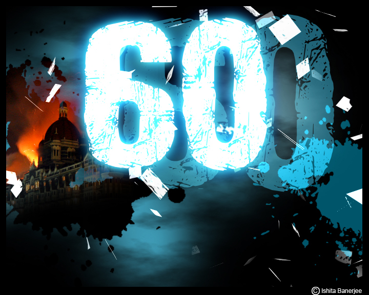
60 HOURS: documentary on the terror attacks on Mumbai, India

This was the most chilling of my projects in TV. Mumbai, India saw its worst terror attacks in November 2008, when a group of terrorists held the city and its people hostage. Our station chronicled the 60 Hours of the terrorist strikes as they unfolded. As a nation we watched in horror as the events rolled one by one and lives were senselessly lost and the iconic Taj hotel billowed smoke as it was set on fire by the terrorists.
This documentary focused on the strike, its drama, its planning, execution and aftermath.
I used a clinical looking blue to break the somber black and red of the design colors. I used vivid imagery, the burning Taj hotel and blood splatter like effects to bring shock and horror to the design. This was not a pretty project and I did not want a pretty desgn. It was rough, ragged, tattered and torn in its cohesiveness
The feelings of chaos, carnage, disgust and dispair comes though in the pacakaging of this show

Title Sequence frames for 60 HOURS


Saturday, July 2, 2011

Using White


White is technically the mixture of all colors, but i absolutely love the use of white. Be it in print designs or for television, white is the color I gravitate to. White looks best in designs which have a 2 Dimensional feel to them, but white on white, white with silver or white with a hint of another bright color can bring to live even the most mundane of subjects. The thing with designing with white is that less is always more to maintain the purity of the white. White can be used both as a positive as well as the negative element of a design.

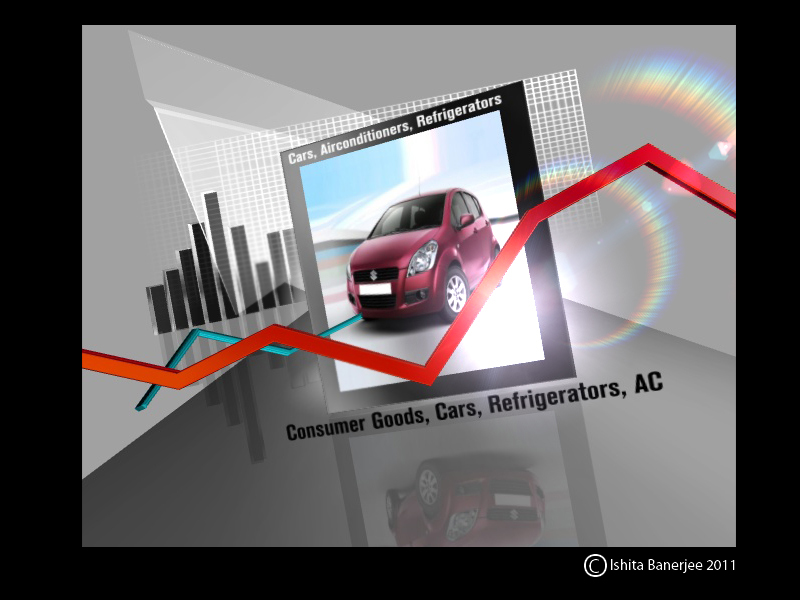
Creatively I love using white with a hint of another synthetic looking color like a bright aqua blue or a deeper vermilion. Recently I did a series of designs for a show on the rising inflation for my TV station. The show was to highlight rising costs of living, escalating prices of essential commodities and fuel and I chose to build my designs on white. 

I began with the basic white and added a grid and a shiny mirror like surface as a base. I used deep grey and silver accents on my foreground elements and added silver text and a bright chroma glow to highlight. The threading color in my all white-grey backgrounds was the use of 3 dimensional graph lines and arrows in the primary colors of blue and red. In an all white glossy yet subdued background..the viewer's eye would first fall on the red and the blue before moving to the other elements.
I deliberately chose an off center arrangement in the layout to break visual monotony and created dynamics in an otherwise simple space. The final text was also kept relatively simple with the word "inflation" getting more prominence with its size and color.

Designs of the title sequence storyboard and graphic templates follow:

Title Sequence storyboard animation of the show " Inflation: the silent killer"
End frame with the show title

Design templates for the show also follow the same style and principles
A single window anchor box
A two-way box graphic plate with the anchor and a guest